SaaS Dashboard UX — What Users Do on the First Screen After Login
The dashboard is the most visited screen in most SaaS products and often the least useful. Learn how to measure what users do after logging in, which widgets are ignored, and how to design a first screen around real behavior.

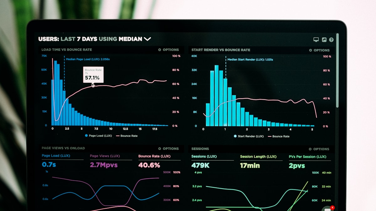
Short answer: watch what users do in the first ten seconds after login. If most of them immediately click away to the same page, your dashboard is a waiting room and that page should be the home screen, or its content should be on it. Use a click heatmap to see which widgets are used, and journeys to see where people go next.
Table of Contents
- The Dashboard Problem
- What to Measure
- Patterns and Meanings
- Design Principles
- New Users and Returning Users
- Key Takeaways
The Dashboard Problem
Dashboards are usually designed for a demo: a row of charts that looks impressive. Real users log in with a task. If the dashboard does not serve that task, it is an extra click between them and their work, every single day.
Because it is the most loaded screen, a small improvement here affects everyone.
What to Measure
| Question | How |
|---|---|
| Where do users go from the dashboard? | User journeys starting at the dashboard |
| How long before they leave it? | Session recordings |
| Which widgets are clicked? | Click heatmap |
| How far do they scroll? | Scroll heatmap |
| What do they click that does nothing? | Dead clicks |
| Does it load quickly? | Real-user performance |
For a logged-in app, mask personal and customer data displayed on the dashboard before recording (PII masking).
Patterns and Meanings
Everyone leaves immediately for one page
The dashboard is a detour. Make that destination the default screen, or bring its essentials onto the dashboard.
Widgets below the first screen are never seen
A scroll map shows most users never scroll. Whatever is down there may as well not exist.
Dead clicks on charts and numbers
Users click a figure expecting to see what is behind it. Every number should lead somewhere: the list it summarises.
Heavy use of one widget, none of the rest
The used widget is the dashboard. The others are decoration.
Hovering over a chart, then leaving
They looked for meaning and did not find it. The chart does not say whether the number is good or bad.
Changing the date range every visit
The default range is wrong. Remember their choice.
Long load, then a click elsewhere before it finishes
The dashboard is too slow to wait for. Check which widget holds it up.
New users pause and click around
An empty dashboard gives them nothing to do (empty states).
Design Principles
- Answer "what needs my attention?" first. Changes, problems, and things to act on, before totals.
- Lead with the most common next action. One click to what most users came to do.
- Make everything clickable. Numbers open the detail behind them.
- Give context. A number with a comparison: against last week, against target.
- Fewer widgets. Remove what is never used.
- Put the most used content at the top.
- Load fast. Show the frame and fill widgets as they arrive (loading states).
- Remember preferences. Date range, filters, last view.
- Let users return to where they were. For many products, resuming is more useful than a summary.
A dashboard that tells the user what changed since their last visit saves them the work of comparing. DeepSync's Pulse takes this approach for product teams: a daily brief of findings with links to evidence, instead of a wall of charts (Pulse).
New Users and Returning Users
These groups need different things from the same screen.
| New user | Returning user | |
|---|---|---|
| Has data | No | Yes |
| Needs | Direction to the first action | Fast access to their work |
| Good first screen | Setup steps, sample data | What changed, recent items |
Serving both with one layout fails one of them. Switch the content based on whether the account has activated.
After a redesign, expect existing users to be slower for a couple of weeks. Judge the change on new users and wait before concluding (novelty and adjustment).
Watch the first ten seconds after login
In twenty sessions, note the first click. If it is the same destination most of the time, you have found what your home screen should be.
Key Takeaways
- The first click after login reveals what users came for.
- Unused widgets and unscrolled sections are clutter.
- Make numbers clickable and give them context.
- Show new and returning users different first screens.
Conclusion
A dashboard should shorten the distance between logging in and getting something done. Measure that distance, and design to reduce it.
Frequently Asked Questions
Related articles


Stay in the loop
Get the latest insights on product analytics and user behavior delivered to your inbox.


